How to structure your content for a website
The impact of a website’s first impression lies in its well-executed design and thoughtful structure. The structure, specifically the order in which website content is presented, plays a crucial role in visitor retention.
Think of selecting a new book. First, you notice the cover. Is it visually appealing? Then you read the tagline. Does it intrigue you? If the tagline captures your interest, you read the summary on the back of the book. Finally, you open the book and dive into the story. You can apply a similar process, known as the Cone Principle, to structure your website.
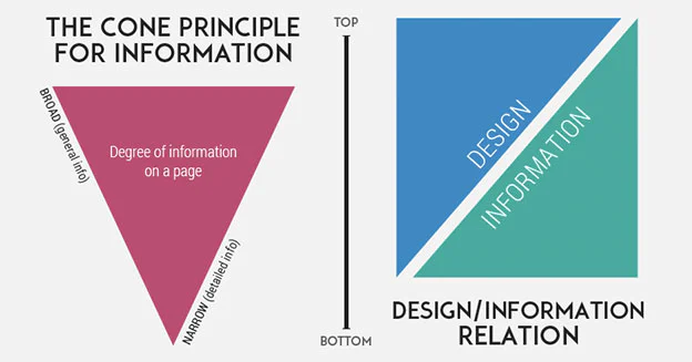
The Cone Principle involves structuring a website’s pages with high-impact visuals and minimal text at the top. As visitors scroll down, the pages gradually introduce more detailed information. This approach allows visitors to quickly scan your homepage and learn about your identity, offerings, and ways to interact with your site.

Why does the Cone Principle work?
According to Hubspot, 46.1% of people consider a website’s design as the primary factor in assessing a company’s credibility, and 40% of individuals respond better to visual information than plain text. The Cone Principle addresses both of these criteria by emphasizing visuals while still providing the valuable information that attracts visitors to your website.
How to structure your website effectively:

The website of eyeglasses company Warby Parker offers a great example of the “cone” structure. Let’s break it down to understand how they executed it.
- Start with a bold image, title, and logo:
The top section of your website serves as a book cover. Choose a photo that represents your business and covers the entire width of the page. If you want to include multiple or portrait images, insert them into a column and add text or another image beside them to avoid empty space.
At the top, include your logo and the most important tabs in the navigation bar. Ideally, limit the number of tabs to ensure they are all visible in a single line. The navigation bar should guide visitors, and providing too many options can confuse them and lead them to leave your site. Finally, overlay text on your image with a concise phrase summarizing your business’s key offering or a sign-up link.
Warby Parker exemplifies this concept on their homepage, featuring a clean logo, a small selection of tabs in the top navigation, striking images, and minimal text.
- Highlight the main product, service, or point of interest:
The next level of your homepage serves as a book’s tagline. This space allows you to emphasize your primary strengths and inform visitors about what you have to offer. For instance, Warby Parker showcases its main offering: stylish glasses. They offer only four options—glasses, sunglasses, men’s, and women’s. It’s evident what they do and where visitors can proceed.
- Entice the visitor to take action:
This section is akin to a book’s back cover. It’s where you captivate visitors, whether it’s through listening to your band’s music, making an appointment, exploring your sales, or signing up for a service. Keep it simple and use it as a teaser for the main story. Save the details for the page you direct visitors to.
Observe how Warby Parker invites visitors to try their product and start browsing their selection of glasses. They provide a direct action (“get started”) to guide users to the next step.
- Provide a summary of other important content:
The final level of your website offers greater detail, such as pricing, contact information, or customer testimonials. This section is positioned above the footer, which serves as a book’s table of contents.
If you have multiple main services or products, divide this section into columns for a dynamic appearance. Ensure consistency in the size of images, text, and other elements within the columns.
Warby Parker utilizes this bottom section to provide more information about the company and links to essential content.
Is the Cone Principle suitable for your website?
The goal of your website is to engage visitors, inform them about your business or services, encourage them to interact with your content, and potentially make a purchase. One way to measure its success is by analyzing the bounce rate, which indicates the percentage of visitors who leave your website without exploring other pages. A high bounce rate suggests that visitors quickly decide to leave due to poor organization or excessive complexity.
Users often make this decision within seconds, highlighting the importance of a well-designed and structured site in captivating their attention.